Problem Statement
The project brief can be summarized as: UI Refresh of Central1's banking website.
Motivation behind changing the looking: the banking institution was losing customers because of their old website. Central1 holds 8% of the Canadian population’s investment and the only way to gain back the perspective
Goals and Project Constraints
• Create a responsive website using Bootstrap and custom components to uplift the look and feel of the current website.
• I was in charge of steering the UX team in creating 65 unique templates that spanned & covered all the different layouts and unique UI patterns.
• My job was to analyze and provide unique solutions to the client given the technical constraints and the given timeline for the project.
• Collaborating with Central1's Lead UX Designer and coming up with unique design solutions that not only impacted the user experience but also help increase the business sales of the website and mobile application was a key part of my role.
Timeline of the Project
There were many technical constraints in this project, one of them time constraints. So User experience, developers and QA had to work parallel with each other.
Expert Analysis of the old website
One of the key findings from the website was it was not responsive and modernized.
• The website’s left side navigation was too big for all it’s menu options.
• There was a lot of wasted space on the right.
Solutions Created for the project
• Showcased how to make the site responsive and aesthetically pleasing meeting industry standards.
• Created a style guide for the entire website to cover all the UI patterns from design to development.
• Make sure all wireframes are technically feasible in the current timeframe of the project
• Make the brand a white label product so that other credit unions have a defined style patterns that could span to different projects.
Information Architecture improved task completion
• The importance of creating an updated architecture before moving to creating mockups was paramount. This helped the team understand the overall sitemap and create qualitative wireframes.
• The overhaul of the Information Architecture increased task completion times by users by over 50% according to a recent usability test conducted by researchers.
Juggling the Style guide and Mockups
• Different layouts had different styles according to their UI patterns. Over here, profile and preferences were a landing page so for such pages, the page would have three cards in a row in the new UI.
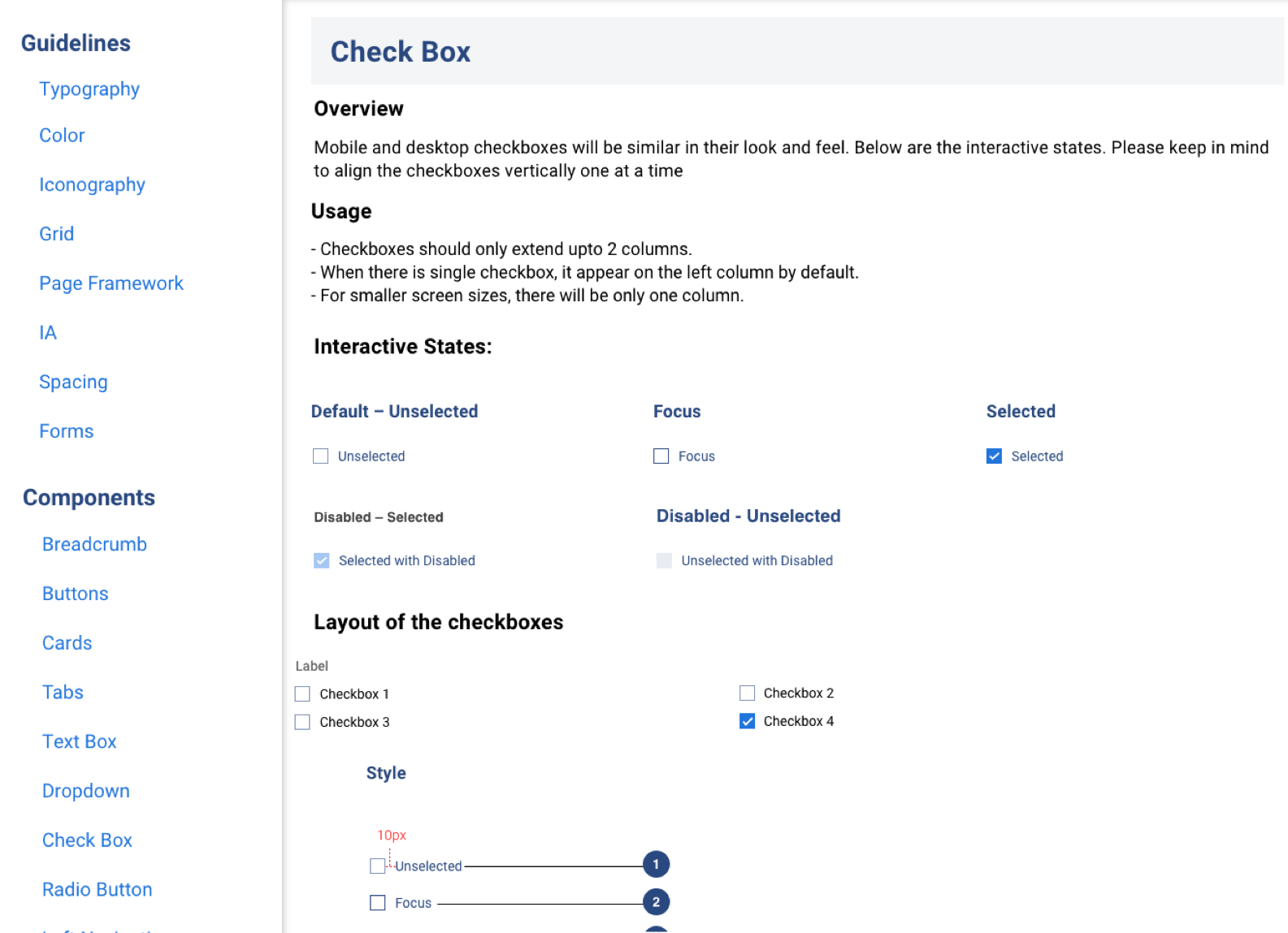
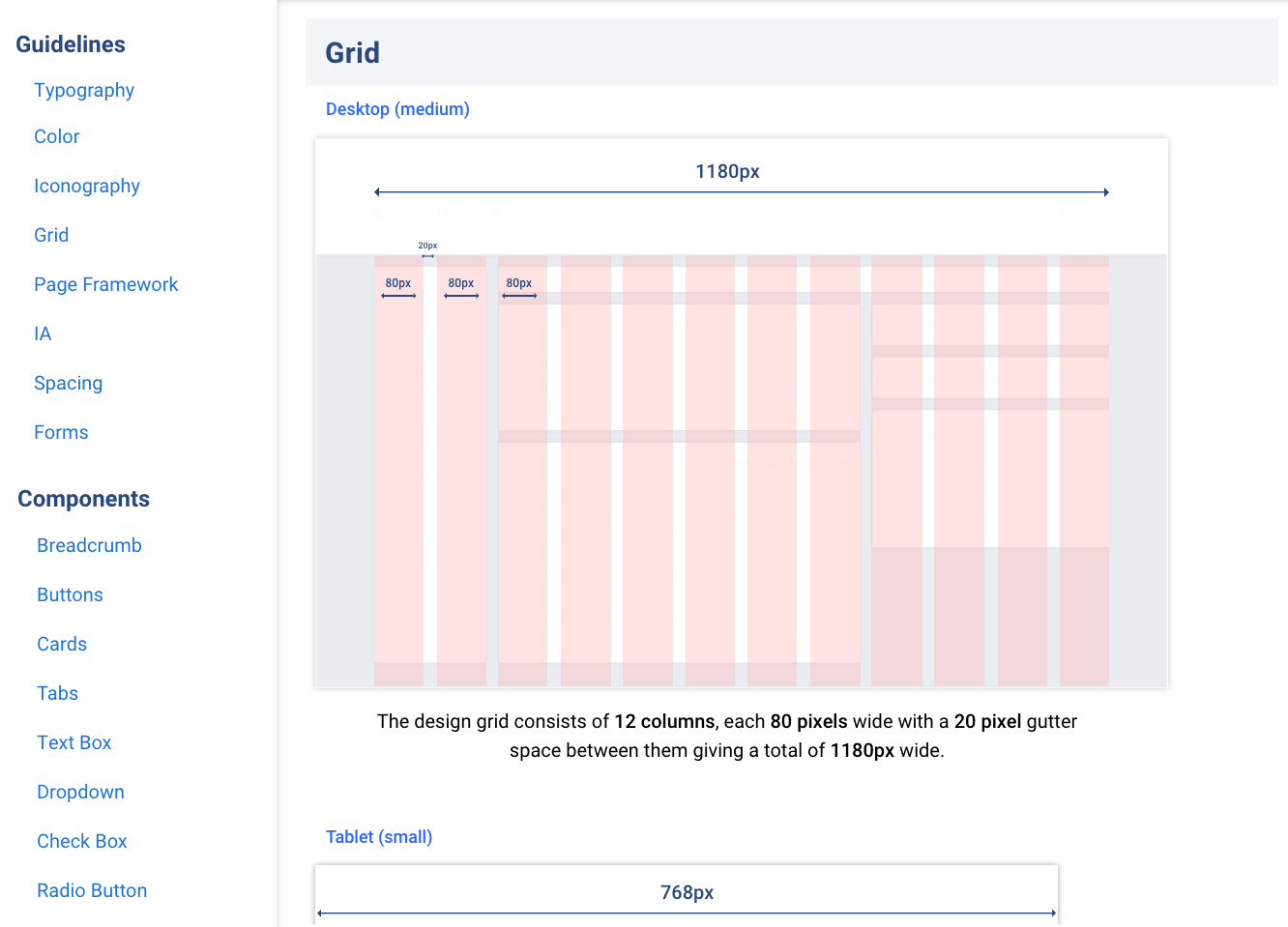
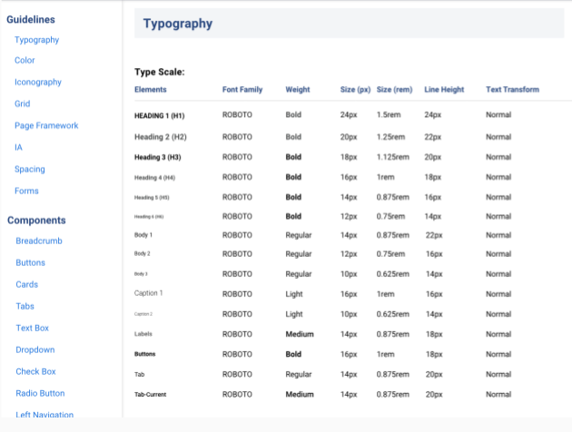
• These UI patterns would be established in the style guide as well.
• You can also see the design team used a fly-out menu below in the after picture instead of regular left-side navigation with dropdowns as it had a lot of sub-menu options within option as found out from the information architecture we conducted.
First Unique Template
Before
After
Below are mockups before we made our final iteration into a flyout menu. We even removed the quick links section and right-side widget as feedback from the champion user of Central1 showed they found user satisfaction rates below average through qualitative analysis.

Account Summary with marketing portlet above quicklinks without right side widgets


Account Summary with right-side widgets


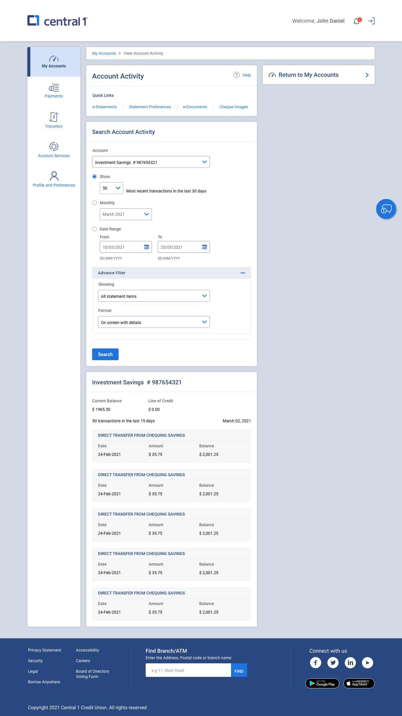
Account Activity with right side widgets and quicklinks

The Style guide increased reduced project timeline
The style guide was a crucial document that QA teams, development teams would validate their testing and development by referencing these guidelines. The style guide was my responsibility and expertise in this project.
Conclusion
Final Goals Achieved:
• Led the design team in creating over 65 unique mockups with different UI patterns that helped characterize the style guide (the most important artifact in the project).
• Created and led the style guide creation and completed it over a record time of a few weeks.
• Kept the stakeholders and team motivated while creating a vision for the product with nice to haves (while making sure they understand the scope and technical feasibility of such artifacts).
What Could have been better?
• In hindsight, the project could have had a better timeline and the stakeholders could have been evangelized about UX from the start to understand the importance of UX and time it takes to make a better website. This could have been done through UX workshops that would involve stakeholders
