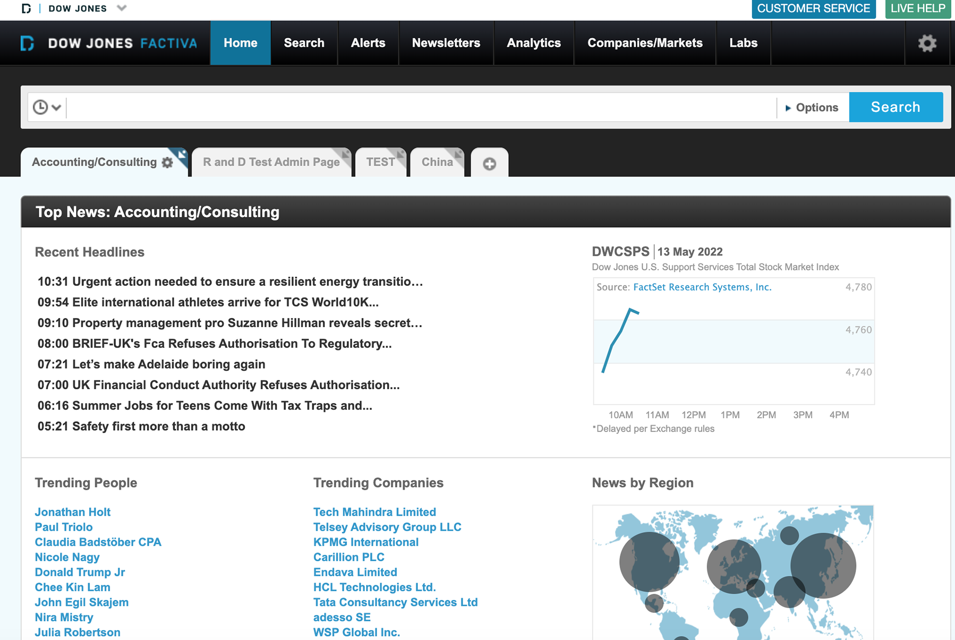
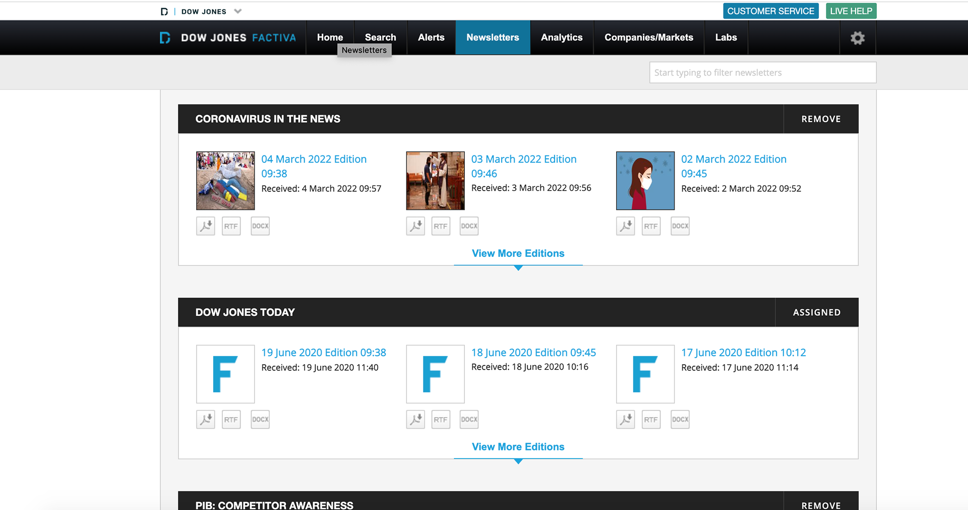
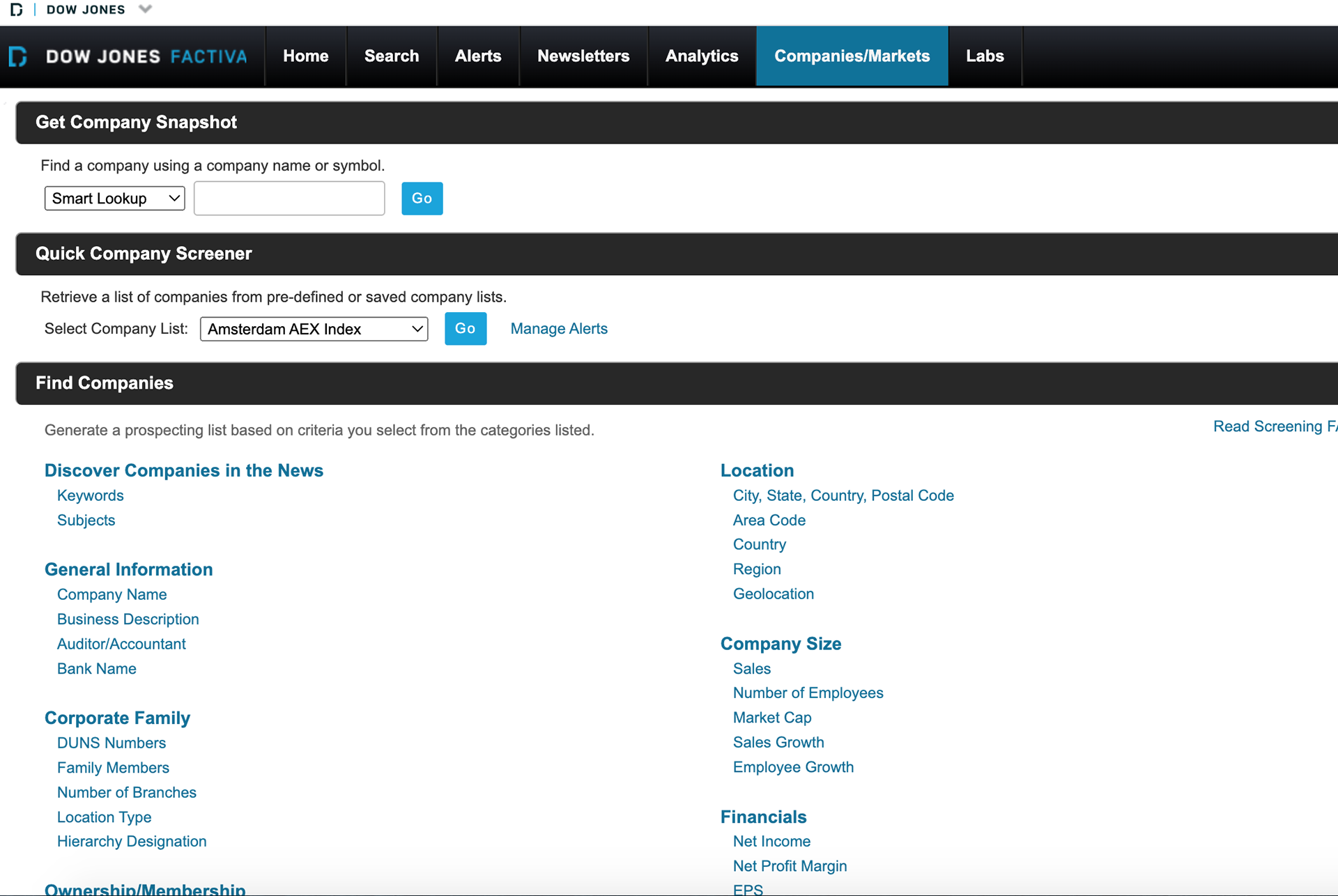
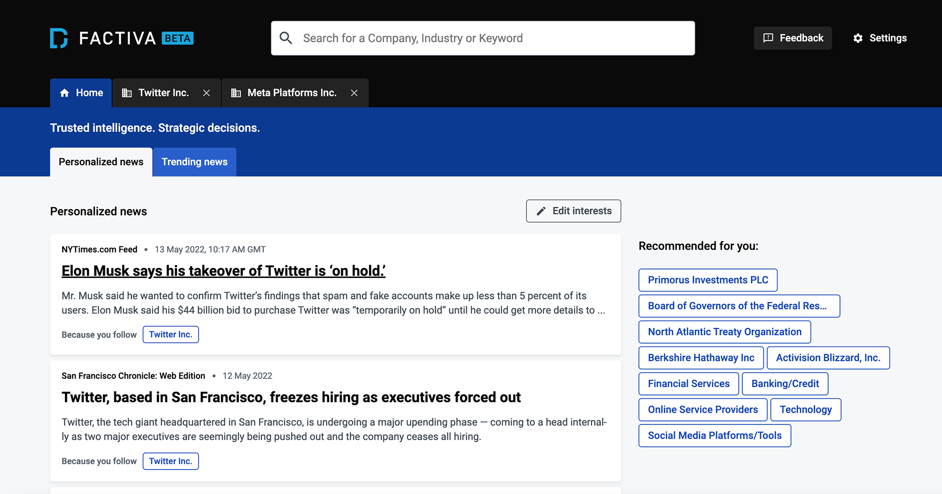
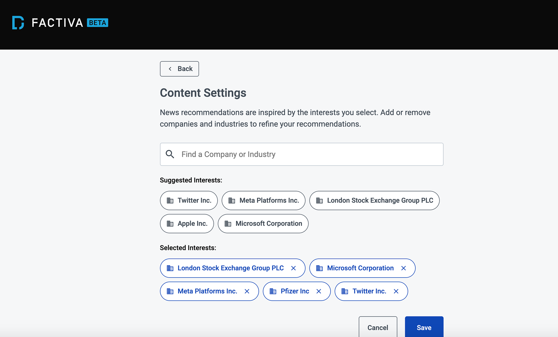
What was Factiva?
• Factiva is a business information and research tool owned by Dow Jones & Company.
• Factiva aggregates content from both licensed and free sources and provides organizations with search, alerting, dissemination, and other information management capabilities
• As the lead UX Researcher of this project, I could steer the research efforts of this project with the help of careful planning and also making sure our target audience's needs were heard by our stakeholders.
• Our main vision for this project was to design a new navigation for Factiva and also to research the new features of Factiva that would affect over 4000 businesses
Timeline
Factiva's team lacked UX maturity
Time constraints for this project was a huge barrier for timely results and analysis.
Collaboration between design and research was very crucial to help the research tests be successful.
No specific timelines were given for a project and the research plan had to make sure I set realistic timelines for research.
Sourcing participants was difficult since the B2B space didn’t allow sourcing participants easily due to security measures.
The B2B space’s UX maturity especially UX Research was low and therefore helping the team understand UX Research was also crucial.
Target Audience
The focus of this project was to recruit external participants rather than internal candidates.
Our target audience included professional researchers and Data Analysts/Consultants
Tools used during this Project
Miro was used during the requirements-gathering phase and help the research and design team generate ideas together.
Figma was used as a design tool to communicate design ideas and wireframes for the usability test.
Primarily, the research team used Userzoom to conduct tests (unmoderated and moderated).
Uncovering the labels needed for the navigation through Open Card Sort
Open card sort was chosen as a research method to generate new ideas for the navigation of Factiva.
We conducted an open card sort and found categories that were most and least commonly grouped.
Through the open card sort, I also tested various labels that users would like to rename or are unsure of.
I also collected qualitative responses from the test to understand the reason behind their labels.
Quotes by the users:
“quick access to Customer Service is missing”
“The things under this label are all items a user can access in a self-serve tab.”
Validating the labels in our open card test throughTree Test
What Were We Looking to Find Out:
Success rate: The percentage of users who found the right category for that task (above 67%)
Directness: The percentage of users who went to the right category immediately, without backtracking or trying any other categories
Time spent: The average amount of time elapsed from the beginning to the end of the task
Method: To analyze the success rate, directness, and time spent by a user in a tree test to validate the open card sort results and to test the information architecture of the new Factiva navigation.
The Why behind using a unmoderated Usability Test
Part of the early design test also included a Usability test (an unmoderated think-aloud usability test)
The WHY: The reason behind an unmoderated usability test was that the participants were mature enough to understand what a usability test was and the time constraints.
The goal of the usability error was to calculate usability errors according to the tasks of the user and give a final impact score to support the prioritization of errors to the team.
I presented stakeholders with detailed qualitative findings from the usability tests along with visuals to help them understand the usability issues from the participants
I used Userzoom to conduct not only my usability tests but all the other tests as well.
To prepare and collaborate with designers in my team, I used Google docs to help them be in the same page as researchers.
Usability testing-Design Wrap Up ratings
Apart from qualitative findings, design up ratings (typical QXR in Userzoom) were calculated to help understand the usability, design, and NPS scores of users
These scores were necessary to benchmark our designs for future considerations.
Conclusion
Early design testing which included tree tests and open card sorts helped us understand quantitatively as well as qualitatively to a certain extent what users wanted to see as labels in their navigation.
The call to change the research method from first click testing to usability test was a good call and helped us further test not only new concepts for Factiva but further excite ‘New Factiva’ to prospective users of Factiva.
From these tests, a lot of typical workflows were uncovered in a typical research/financial analyst's customer journey.
Future Things to Consider
Push leaders and other stakeholders to understand UX Research further in the B2B space.
Help stakeholders understand the business sense of investing in UX Research, for example: to increase our budgets for Userzoom particularly helping us increase our credits and Intellizoom slots so as to increase our research sessions for Factiva.
Benchmarking was crucial to consider for future designs. The first step has already been implemented in terms of design wrap ratings in the first usability test.
First Iteration of the updated Factiva Wireframes
The wireframes were solely created by me to test them out for a usability test as I was the sole member of the UX team.
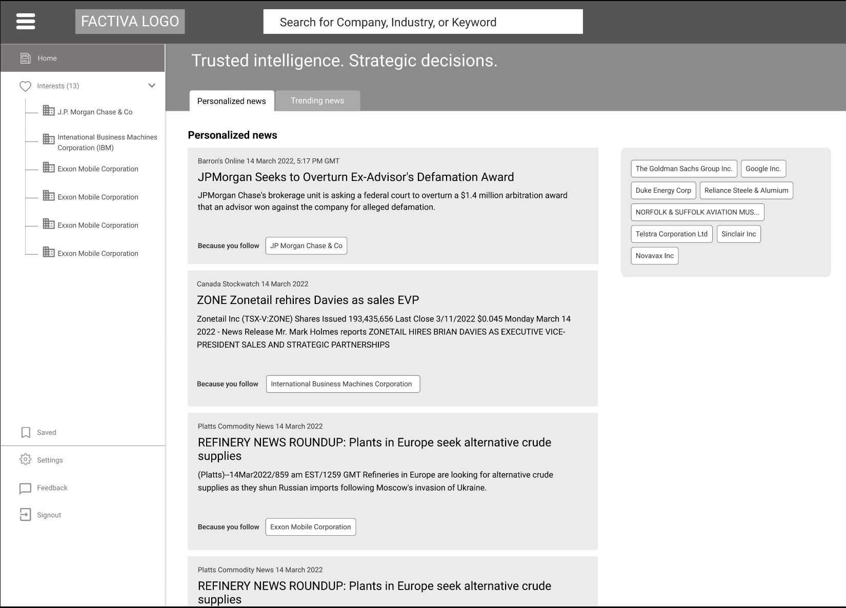
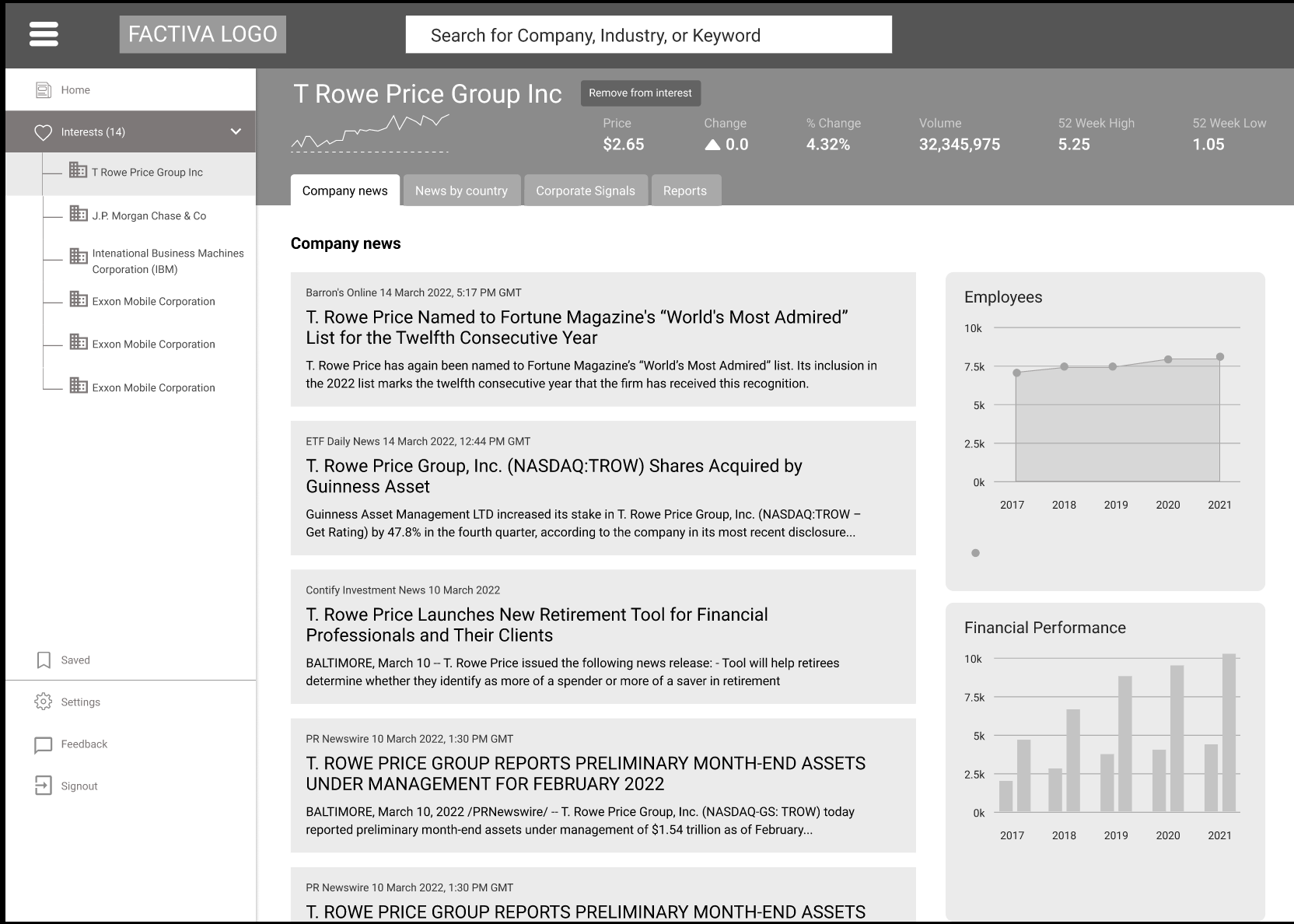
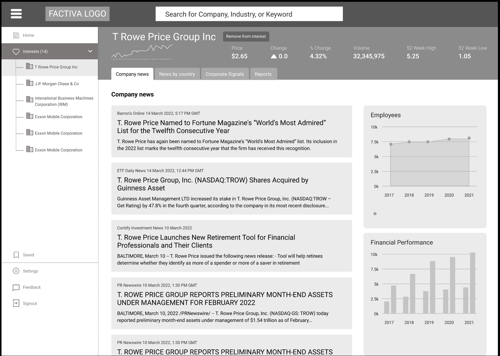
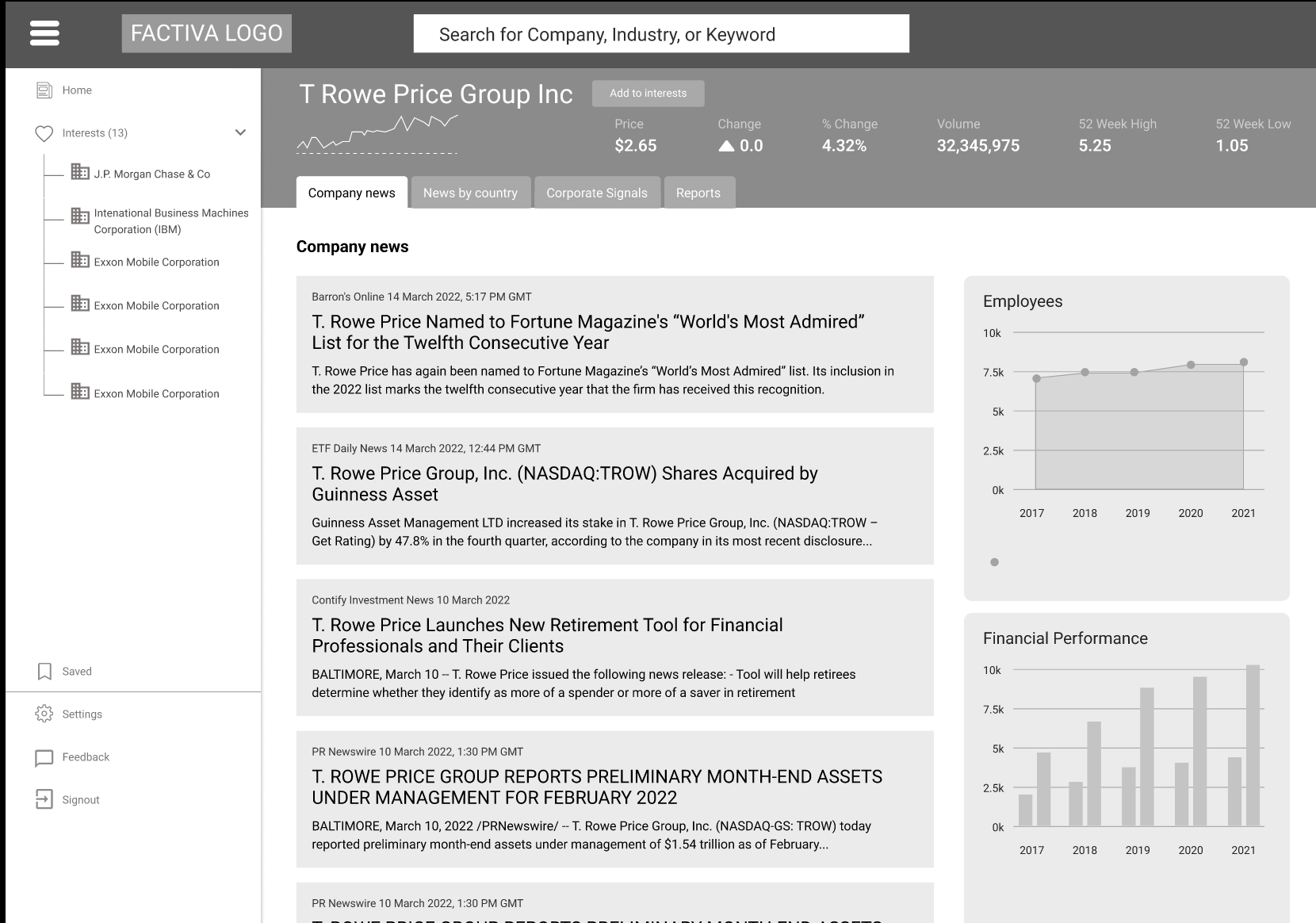
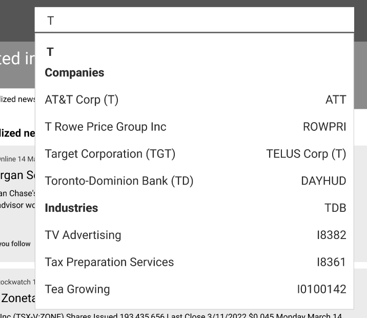
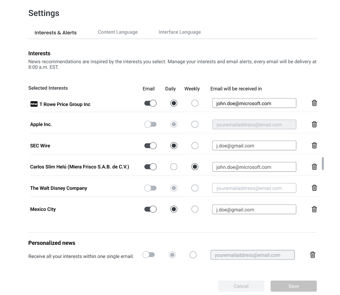
High-fidelity wireframes were created after the low-fidelity wireframes were reviewed by the team. Feedback was gathered in Figma using the comments feature and a few real-time design meetings
